Utah State Tax Commission
A Responsive Web Design Case Study
UI Design · Interaction Design · Site Mapping · Prototyping

Project Specs
Role: UI Designer
Date: July-August 2021
Project Duration: 4 Weeks
Tools Used: Figma, Figjam, Adobe Illustrator
Team Members: 3
Project Overview
Teams were tasked with selecting a government website, identifying problems users encountered while interacting with the site, and any user interface pain points. To simplify the process, teams were restricted to state tax service websites from a pre-determined list.
From there, individuals on the team came up designed and tested a concept for a site redesign.
The Problem
The organization of the Utah State Tax Commission website creates some usability issues when users are trying to locate important information.
The Solution
Redesign the website's information architecture and site map by condensing the navigation into one menu.
The Design Process
01- Website Analysis
02- Information Architecture
03- UI Design & Testing
04- Interaction Design

01- Research
User Research
Goals/Tasks
The objective of the User Research Plan was to test the user's ability to use the Utah State Tax Commission website to quickly find information on Utah state taxes.
Any usability issues would hopefully be found through user testing with the following tasks:
- Find instructions for filing the Utah Stat Income Tax form.
- Find instructions for filing the Utah State Corporate Tax form.
- Find the Taxpayer Access Point ('TAP') F.A.Q. section.
Methodology
The team interviewed 5 people over Zoom and gave them the three tasks listed above to accomplish on the Utah State Tax Commission website.

User Testing Success Rate
The team conducted 5 user tests on the current Utah State Tax Commission website. Users were given 1 point for a successfullly completed task, 0.5 points for a partially completed task, and 0 points for a task left uncompleted. However, the test did not measure how quickly the users took to complete each task.
The average success rate came out to 86.66%. The main usability issue is with how the site organizes its information. This has an effect on the user's ability to quickly and accurately find the information they need.

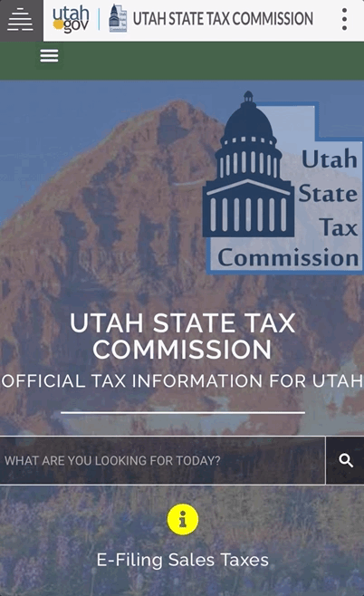
User Interface Annotations
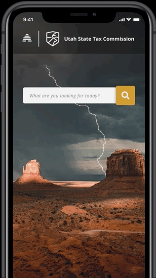
01- Homepage
- Users liked the background image that featured Utah's natural beauty.
- Users think the website looks like a government website.
- Users think the website is easy to access and navigate.
02- TAP Navigation Menu
- Users thought the TAP menu was confusing.
- Some users expected to find the FAQ section here.
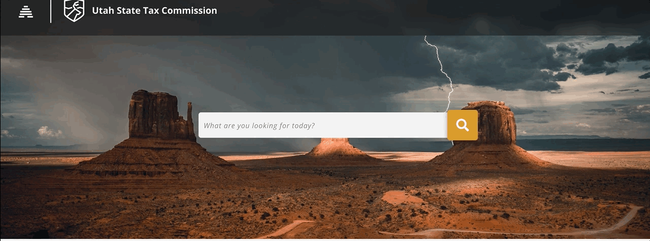
03- The Search Bar
- Users thought the search bar was easy to find.
- The dark, semi-transparent background makes the muted text hard to read.
04- Homepage Links
- Users thought the links were hard to read.
- Users thought the links should be rearranged.

02- Information Architecture
Navigation Usability Testing
The team tested 3 users on the usability of the Utah State Tax Commision's website navigation. Two of the users were tested on mobile and one was tested on desktop.
The website has three separate navigation menus, so we wanted to test how well the users would navigate these. The users were asked to complete the following tasks and give their opinions on the navigation:
- Navigate to the Utah Taxpayer Access Portal (TAP) website, then back to the Utah Tax Commission homepage.
- Navigate to the Utah Division of Motor Vehicles website, then back to the Tax Commission homepage.
- Navigate to the Utah Tax Property website, then back to the Tax Commission homepage.
Navigation Testing Results
Every user was able to complete each task with a 100% success rate. However, the team still considered the navigation to be a failure. When users were unable to quickly find an item in the main navigation, they scrolled further down the homepage to find what they were looking for.
On the mobile site, users only ever looked under the main navigation, collapsed underneath a hamburger icon. Confusingly, tapping on the kebab menu opened up a navigation bar with the Tax Commission candy box menu. Users have to tap on the candy box menu twice to open it. However, because the menu failed to open the first time it was tapped on, users assumed this menu was not functional and they did not attempt to open it again for the remainder of the test.

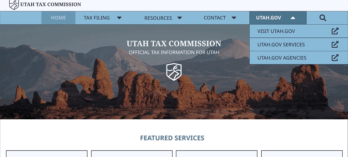
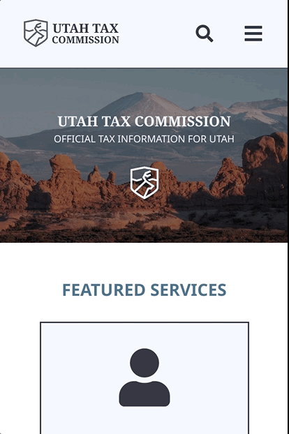
03- User Interface Design & Testing
Mid-Fidelity Mobile Navigation Wireframes


Mid-Fidelity Desktop Wireframes


Five Second Usability Test
Users found the desktop wireframe easy to understand and navigate, they did suggest making the expanded search bar smaller in the final iteration.

04- Interaction Design
User Interface Style Guide
UI Style Direction
The Utah State Tax Commission website is the official online source of tax information for the state of Utah. The UI for this redesign was inspired by the natural beauty of the state of Utah. The UI design should not be distracting to the user or make things difficult for the user to find.
UI Style Adjectives
- Professional
- Informative
- Helpful
- Trustworthy

Typography
For the first iterations of the wireframes and prototypes, I used Noto Serif and Noto Sans.
For the final iterations of the wireframes and prototypes, I changed the typeface to Open Sans, which is the typeface used by the Utah government on their websites.

Color Palette
The color palette was inspired by Utah's natural beauty. Blues for their skies and lakes make a nice complement to the earthtones inspired by the natural rock formations found inside the state's borders.

Logo
The logo is an original design by me for the purposes of this project. It features a stylized Rocky Mountain Elk—the official state mammal of Utah—inside of a shield. Mountain peaks can be seen behind the elk.
Hi-Fidelity Prototypes
Desktop
For testing the desktop prototype, users were asked to complete the following tasks:
- Find the navigation item labeled "Individual Income Taxes"
- Find the card labeled "Tax Professional Information"
- Find the Tax Commission Office Hours
Mobile
For testing the mobile prototype, users were given the following tasks:
- Find the navigation item labeled "Tax Instruction & Training"
- Find the card labeled "Motor Vehicle Portal"
- Find the phone number for the Tax Commmission.
Clickable Prototype Results
Three users were tested on both the desktop and mobile prototypes. The test yielded a 100% success rate. Users commented that the cards on the mobile prototype were too big and that the navigation bar could be decluttered further.

Final Prototypes
Desktop
For the final version of my prototype, I adjusted the color palette from my hi-fidelity prototype to their final version.
The beehive/hamburger menu was brought back into the final design since the beehive is an important part of Utah's state history. Desktop users would hover over the beehive icon to see it change into the hamburger menu symbol.
The design of the navigation menu was inspired by the full screen navigation menu on the official utah.gov website.
Mobile
The full screen navigation menu also appears on the mobile version of the final prototype.
Instead of hovering over the beehive icon, the user taps it. It will briefly transform into a hamburger menu before the mobile menu fully opens.
Final Thoughts & Summary
My next steps in further developing this website would be to create more pages for desktop and mobile. On the "Forms & Publications" page, I would like to redesign the download links so that the user knows what type of file they are selecting. I would also like to make it more clear to the user whether or not the form they are clicking on is a download link or a file they can view in their browser.
